DIO
DIO is a location based dining app. Its goal is to help users connect people with local restaurants that are within a short distance of a given location. DIO uses noise level and ambience to attract users to what type of dining experience they would like.
Role
UI Designer
Scope of Project
October 2021- April 2022
Challenge
DIO launched the app in October of 2021. After going into beta, DIO was seeing good recognition and responding well through the App Store. Within a 3 week upon going live, DIO was seeing an average of 8 visits a day. The business was in its infancy and had approximately 11 restaurants signed up for a 90 day test run. DIO needed to get more followers to build traction with its partnering restaurants. The CEO of DIO reached out to me for advice and guidance for how to elevate the product, gain a user following, so that way the prodcut could gain traction.
Process
I went through the DIO experience on my phone and took notes and screenshots of what I was seeing and experiencing. I noted that the content was informative and helpful for restaurant goers, yet I found that the manner in how the information to be displayed to be overwhelming. The content was often displayed center aligned, which threw off standard reading patterns. Iconography seemed to be the biggest emphasis of how to educated users, yet some icons were confusing and misleading unless broken out or explained later in the process.
User Interface as designed by DIO Engineers for Phase 1.
Solution
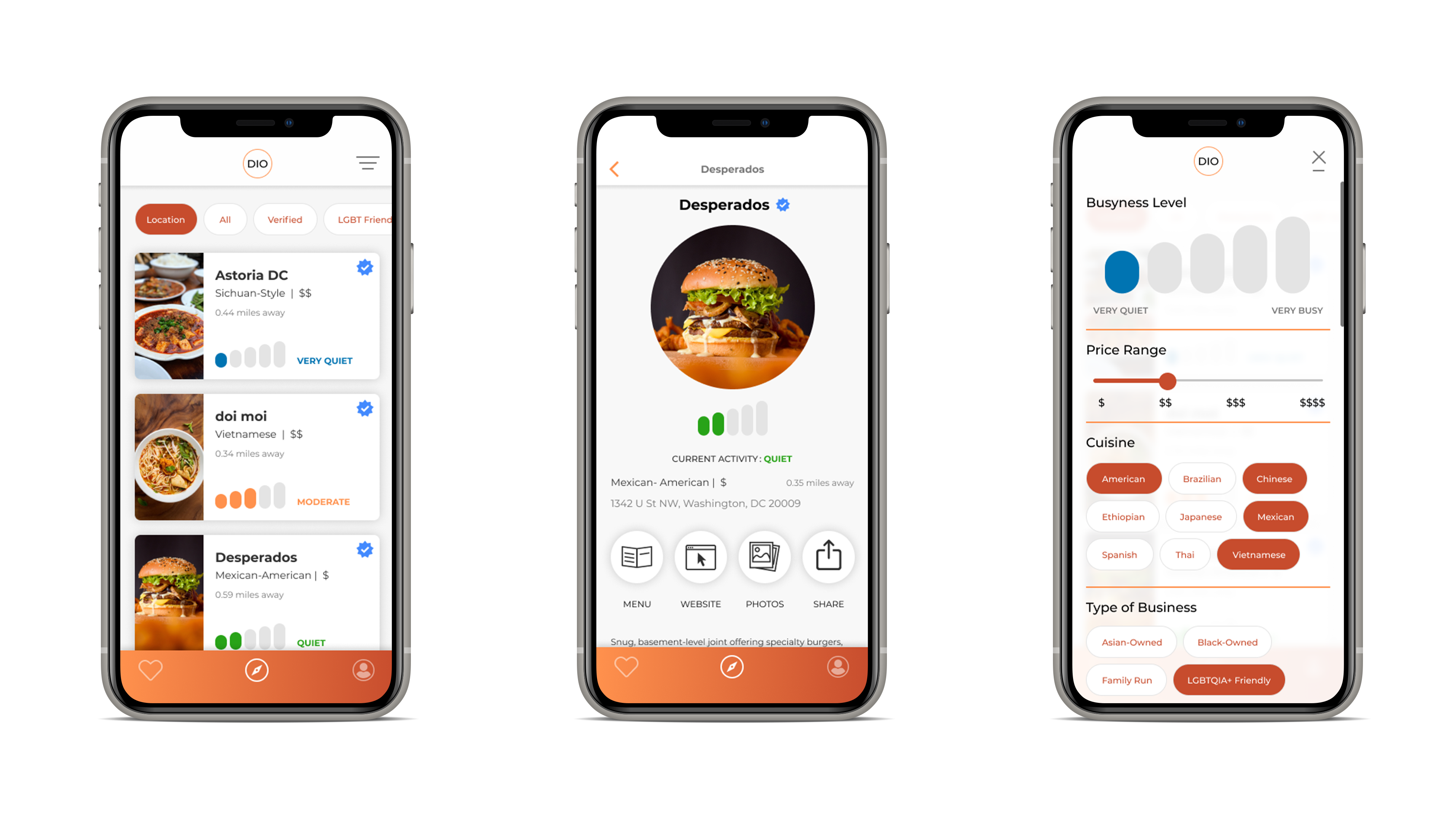
I decided to strip the DIO application and emphasize more of the brand and the unique model that drove the app’s functionality. I took the card stylings on the main dashboard and made them more approachable with visual images of food that enticed users to eat. I created a better typographical hierarchy which helped with users scanning the page as well as inciting them to scroll down for other options. I took the noise level indicator and placed it at the bottom to display how. I simplified the iconography to make it more understandable for users to understand the differences within the restaurant.
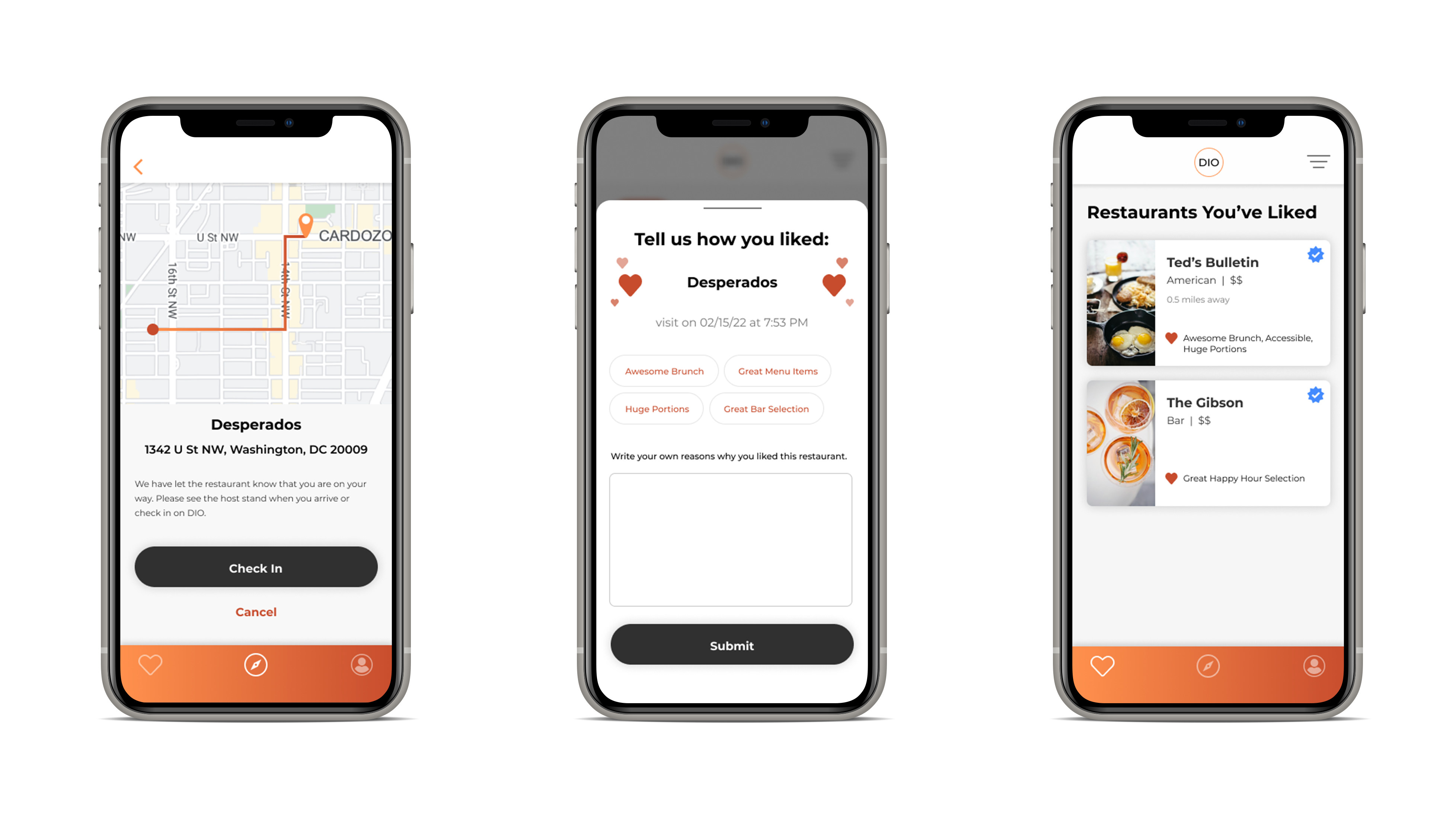
Glimpse of user flow as user checks in, writes a review of the local restaurant, and sees their liked restaurants.
Outcome
I directed the DIO engineering team conducted an A/B test focusing on the. Within 30 days of the test, user activity increased to about 102% with the designs I created. Seeing the suceess in testing, DIO's product team moved forward with the design. Post its launch in April 2022, DIO was able to increase its user visits to 1,122 users a day. With the increased user activity, DIO was also able to increase partnership deals to well over 50 restaurants in the Washington D.C. Metropolitan area.