Huggies Club Milestones
Fetch is a rewards based app that rewards its users with points to be used as gift cards. Fetch rewards it users by taking their shopping receipts, scanning in their data, and using that data to see how they shop with partnered brands. The more users shop with partnered brands, they get more points for their purchases. In turn, our partner brands could target more of their goods to the right markets and demographics.
Role
Product Designer
Scope of Project
August 2022 – November 2022
Challenge
Fetch had a series of partnered brands which they wanted to increase engagement in a fun and unique way. For users who were loyal to a particular brand, the product and the partner development teams at Fetch came up with the idea of having an exclusive way to earn more points at a higher rate. This concept was know as Clubs. The product team and partner teams wanted to test run Clubs with highest engaged partner—Huggies—in order to increase traffic to the Fetch app and get more people shopping. This would then increase brand sales and, in turn, get more points for gift cards through the Fetch app. The problem that arose with Clubs was that Fetch users were having a hard time grasping the benefit of joining a Club. With a new feature called Milestones, Fetch wanted to see how motivation through task completion could help increase user engagement.

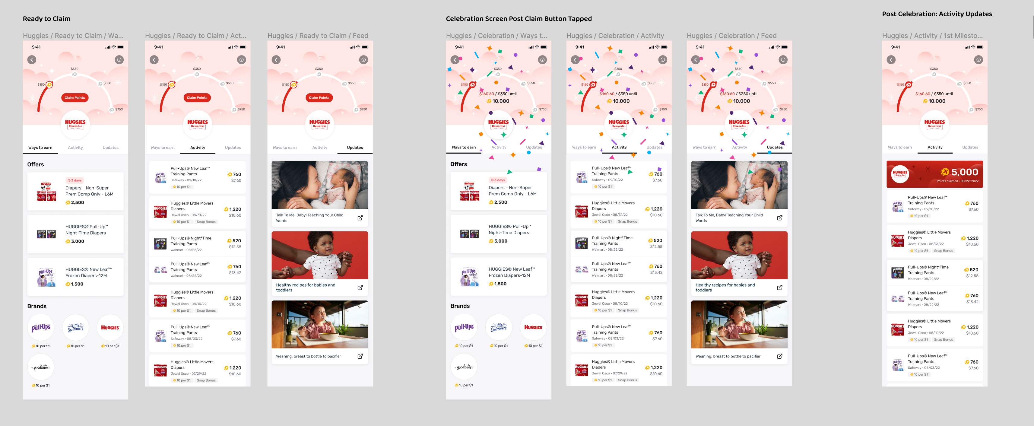
Early user flow model for the Huggies Club Milestones.
Process
Coming into the experience midway, I started off by diving into the history of Clubs and the different iterations. I conducted a visual analysis and found a lot of use of circle to show completion and lines towards a marker show task achievement. I noticed that the porportions seemed off no matter which approach, and they took a lot of screen space in smaller devices. The interface explorations were difficult to follow as some approaches went off screen, unclear of what tasks the user had completed, claimed, and were working towards.
Upon my research, I read articles regarding motivation and completing tasks; one in particular was article that deemed to help the most was Autonomy, Relatedness, and Competence in UX by Tanner Kohler of the Nielsen Norman Group. Upon my reading, I realized that Fetch was allowing our users to be very autonomous, we needed to connect the relatedness of why they should sign up for the club's Milestone feature. Our feature was not very competent in how users could earn more points with little to no explanation. This sparked a new motivation to research outside our app to see other examples of successful task completion in successful user interfaces.
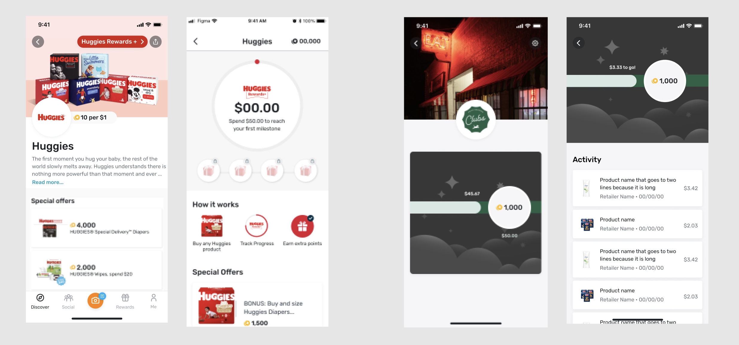
Early variations of Milestones within Fetch Clubs. Version 1 (left) was created in 2021 and Version 2 (right) is a templated design toward the end of 2021.
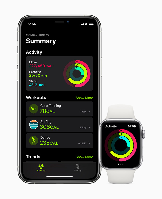
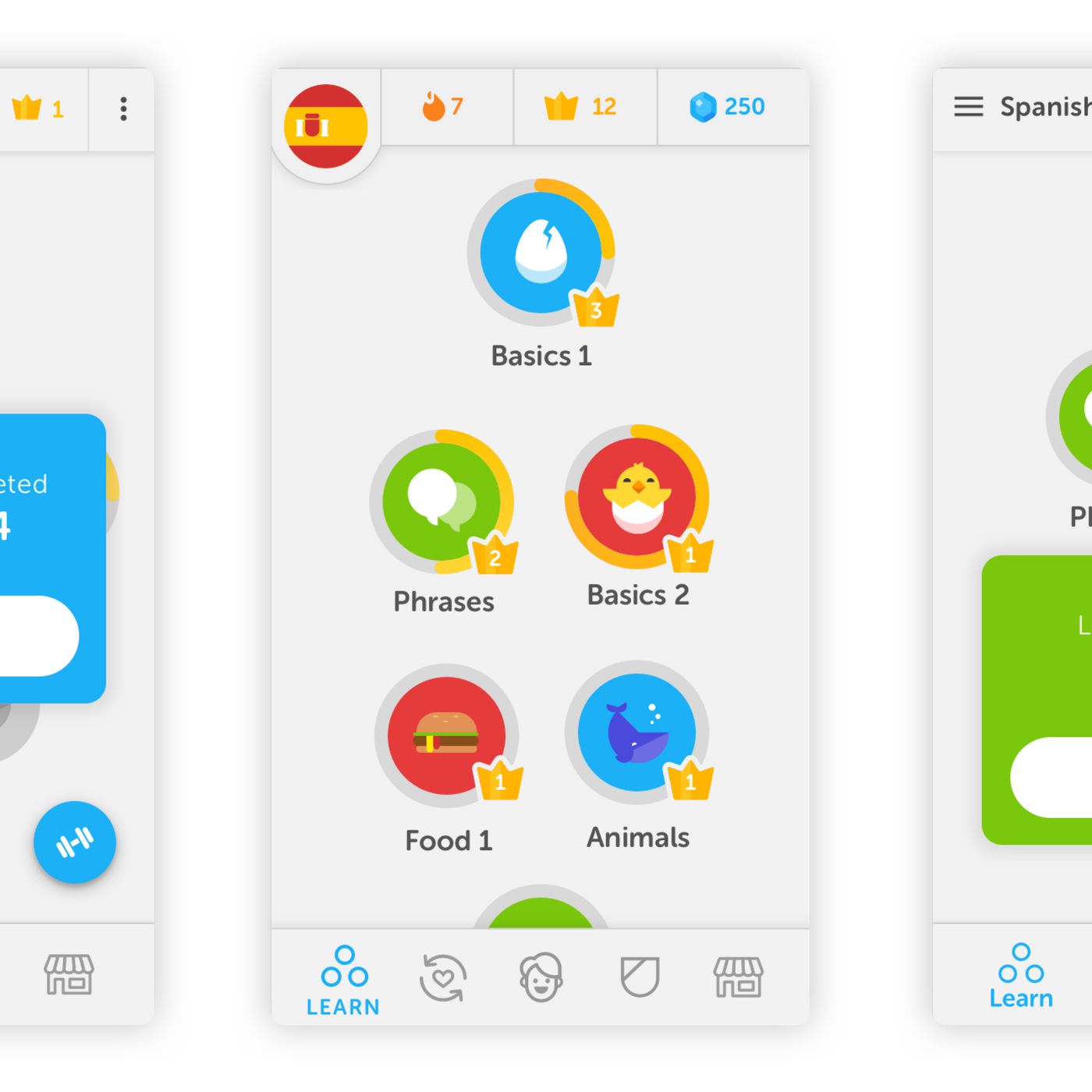
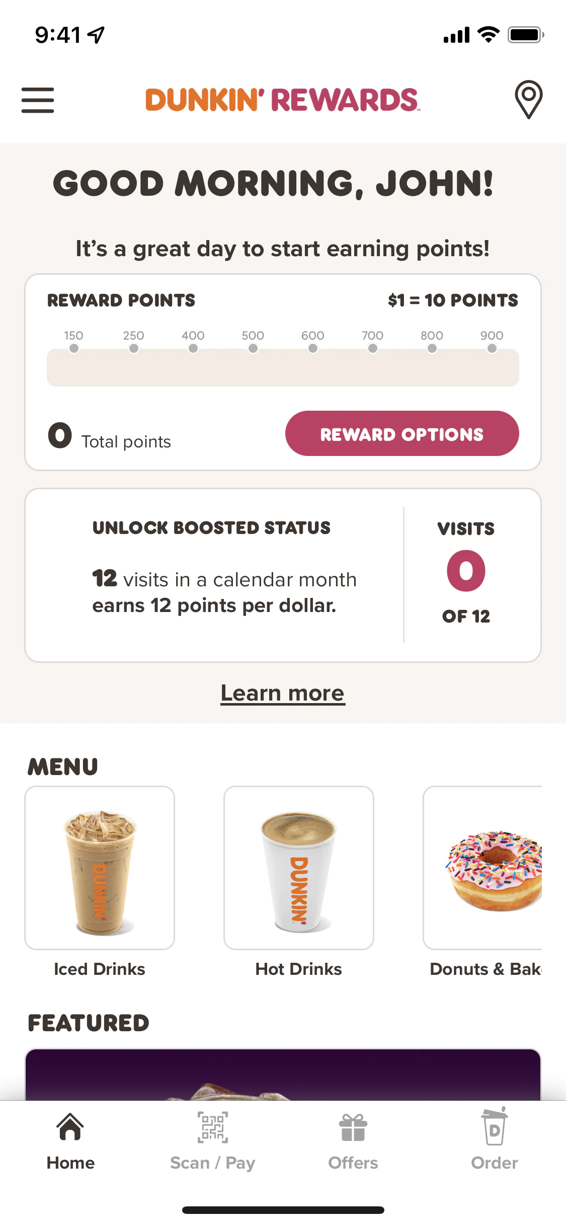
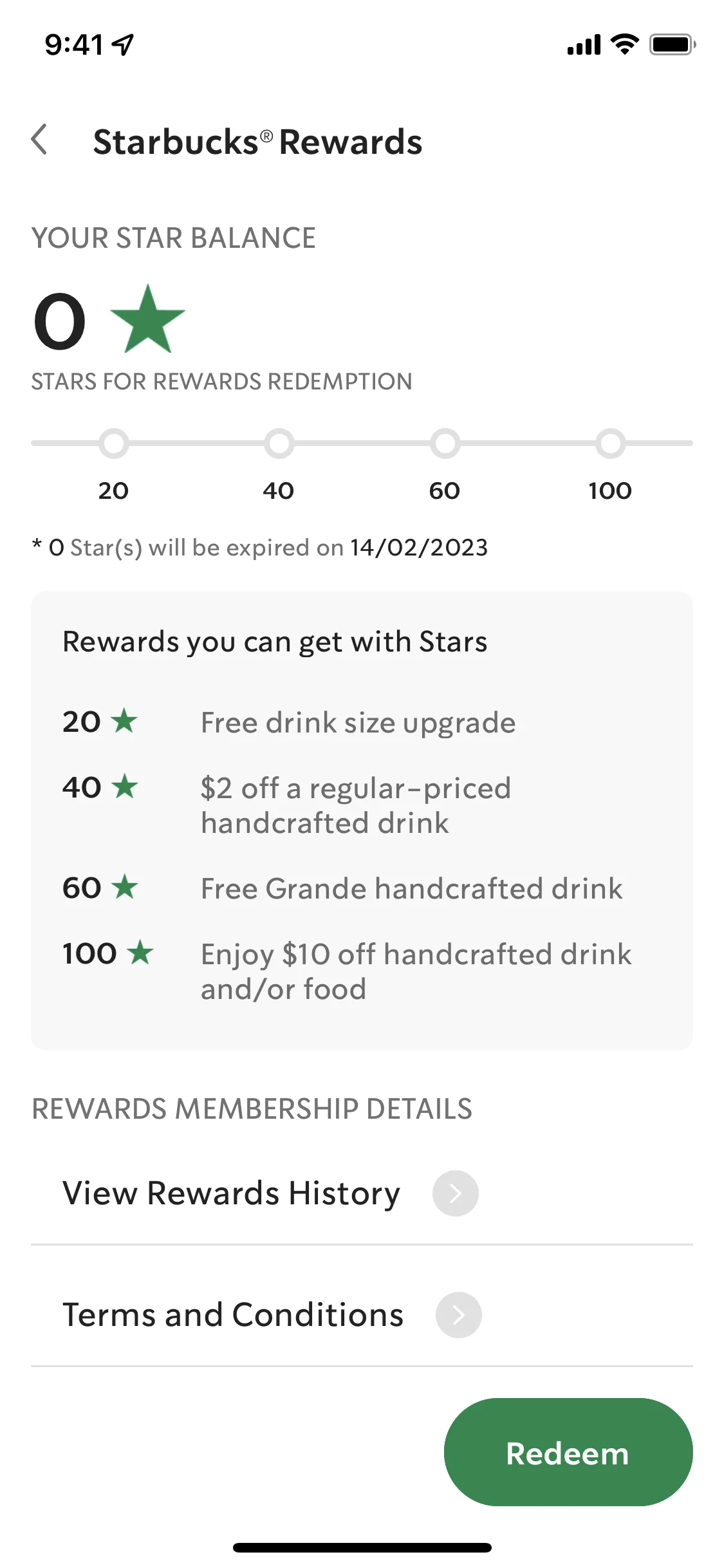
Competitive analaysis of circle and line task completion and competence
A big take away from this research was the fact that there was no clear user base I noticed when it came to Milestones. After talks with partner development, I was able to focus and identify the Milestone feature for 3 key user types:
- Parents expecting their first child
- Parents who have more than one child under the age of 5
- Caretakers who use diapers for loved ones or patients
(ex. A smaller sized person with a disability)
Solution
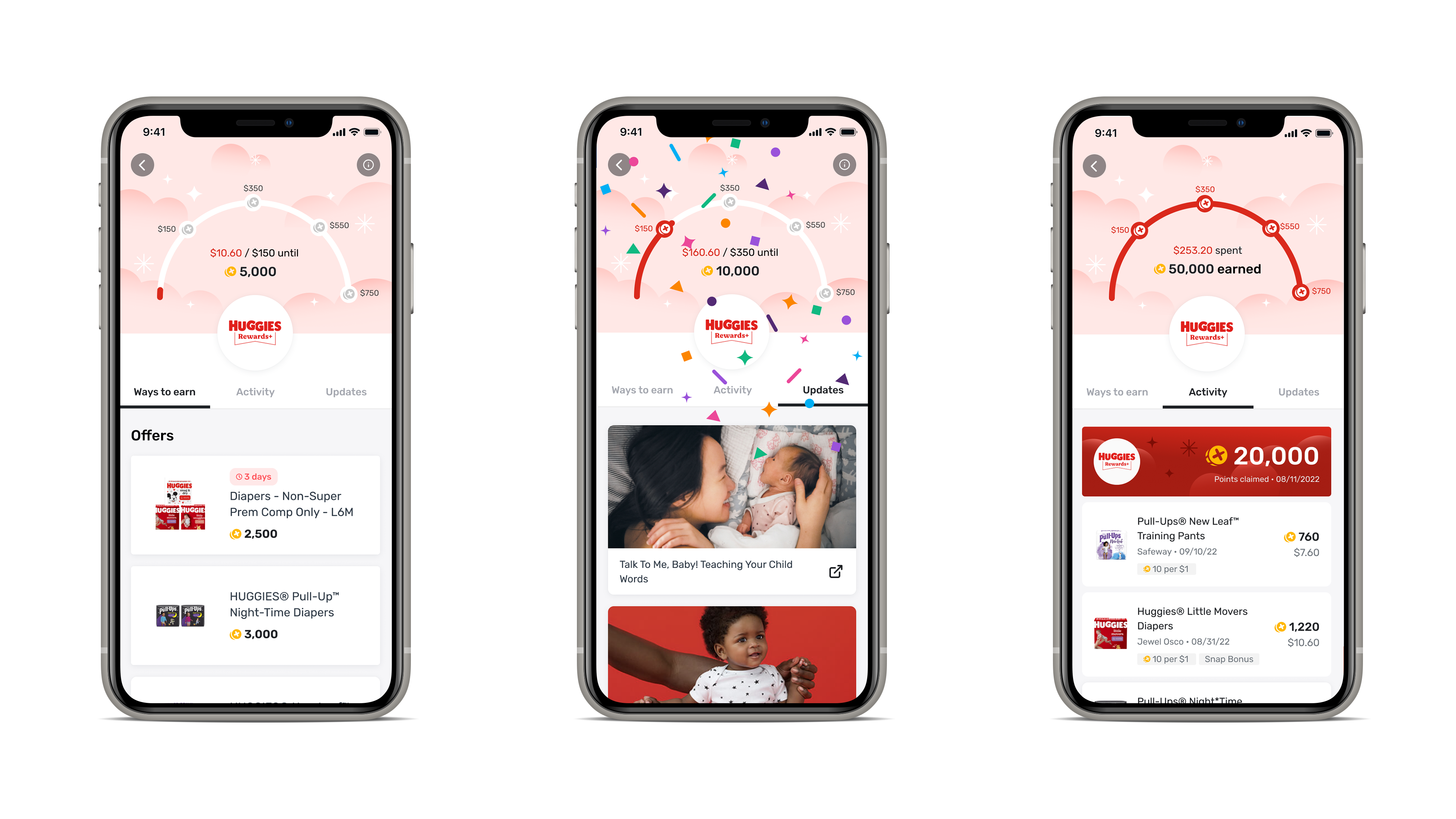
After my reasearch, I immediately went to the drawing board and thought of ways we could enhance the Huggies Milestone experience. First, I decided to change the layout. I decided to keep the points earning interface at the top, but utlize a tabbed navigation for content to unveil new and interesting items the club has to offer. Next, I decided to combine the visual forms of a circle and a line to create what I call, the Points Arch. The Points Arch was the best way to execute this design as it allowed the task path the narrow height of the line, the rounded nature of the circle to space out multiple milestones, and still keep everything in once frame. Finally, I consulted with my Android and iOS developers to see how we could archetype the Point Arch to fill in, change states, and articulate the user's points earning potential.
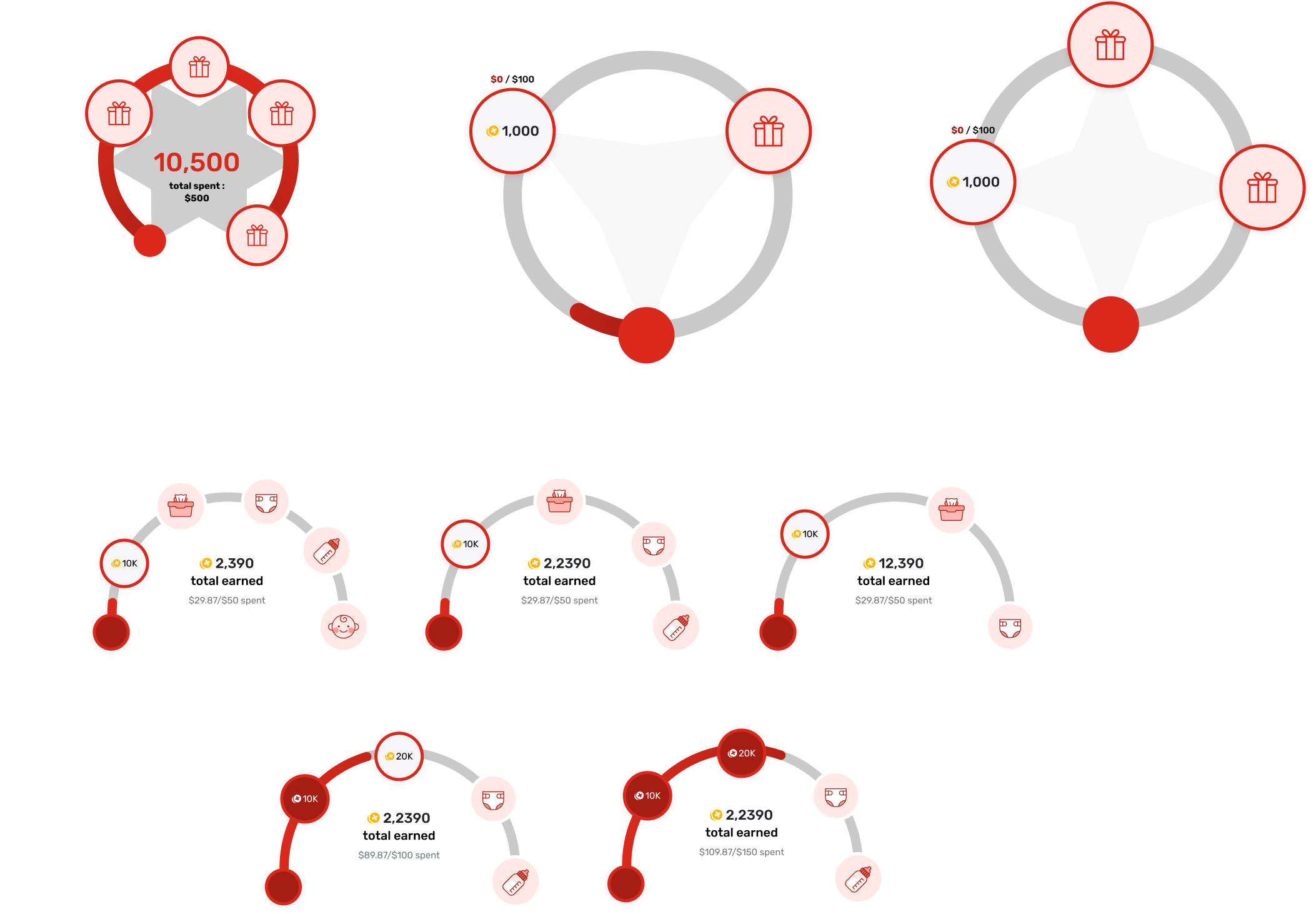
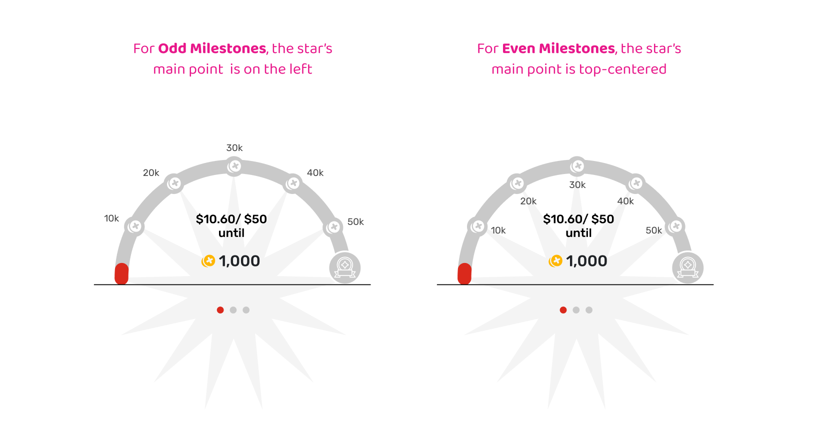
Visual studies of semicircle (top) and first execution of milestones (bottom)
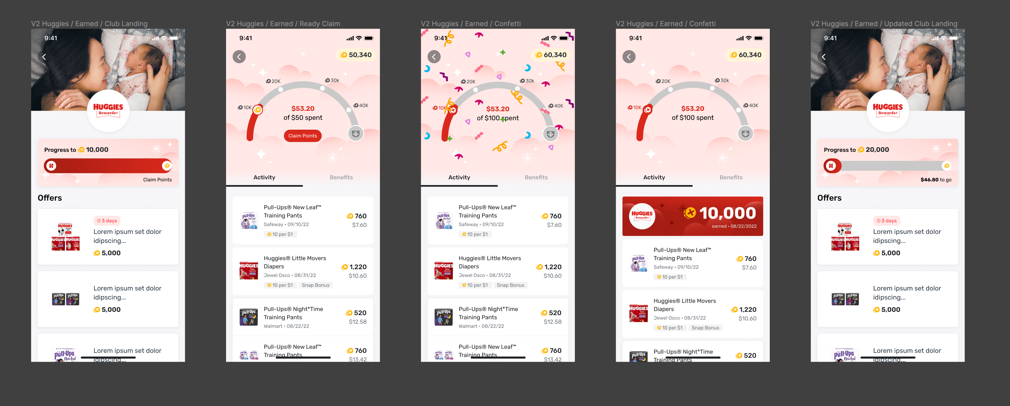
Once the development was secured, I focused the design with colors, illustration, and animation. Realizing that 94% of the Huggies Club demographic are parents with children, I chose to go with a pastel color pallet for the background, allowing the contrast of Huggies branded red color as the guiding visual for points earning and rewarding. With the help of our in-house illustrator, I explored eye-catching backgrounds and iconography for the Milestones experience and how they could translate for future iterations of the product. To increase engagement even more so, I experimented with a pulsating "Claim" button and confetti animation to entice and excite users once they reached a milestone.
Outcome
With the launch of the new Huggies Club Milestone experience, Huggies became the top preforming brand in the Fetch app. Towards my departure in November 2022, Fetch was able to reach 1 million new users for the Huggies club. With success of the research, the new layout, and strategic animation, my design became the frame work for two new clubs in the Fetch app—Pepsi and General Mills.
